Using machine learning to predict the 2019 MVP: mid-season predictions
Summary
Introduction
With James Harden's recent stretch, the Nuggets' success despite their injuries, and the Bucks maintaining the second seed in the NBA, Harden, Jokic, and Giannis all have strong cases for MVP this year. Though Harden hasn't had the same team success as Jokic and Giannis, he's been averaging an absurd 34.2 PPG - almost 5 PPG more than second place Steph Curry. On the other hand, Jokic has been leading an injury-riddled Nuggets team to the first seed in the West. Along the way, he's had numerous incredible all-around performances, such as Monday's 40/10/8 game against the Trail Blazers. Jokic averages the 9th most assists per game in the league, an unprecedented figure for a center. Meanwhile, Giannis has been posting a hyper-efficient 27/12/6 while leading the Bucks to the NBA's second best record. In addition to these players, Curry and Kawhi have legitimate arguments for MVP, as they've played very well for the best teams in the league.
For much of the beginning of the season, many saw Giannis as the MVP favorite. However, the race seems tighter now than ever.
To predict who will win MVP now that we're just past the season's midway point, I created various models that try to predict this year's MVP.
Methods
This post uses very similar methods to my post that analyzed the least and most deserving MVPs of the past decade. Like the initial MVP post, I use a database of all players who placed top-10 in MVP voting since the 1979-1980 season (when the 3-point line was introduced). I measured the following stats for these players:

* Share of MVP votes = % of maximum votes received (so Curry's unanimous MVP is a vote share of 1).
For both this season and lockout seasons, I scaled up win shares, VORP, and wins to an 82 game season.
My initial MVP post used many of the above stats to predict vote share. The new models used in this post use fewer parameters, as several of the parameters in the previous post introduced collinearity. For example, having VORP, BPM, and MPG together is bad, as VORP adjusts BPM to MPG. For these models, I used only the following stats as parameters:

Using these parameters to predict vote share, I created 4 models:
- Support vector regression (SVM)
- Random forest regression (RF)
- k-nearest neighbors regression (KNN)
- Deep neural network (DNN)
Unlike the previous MVP post, the models were trained and tested using all data from the 1979-1980 season up until the 2017-2018 season. They then predict the MVP from this year's data. I predicted the MVP vote share for the top-10 players on NBA.com's January 11th MVP ladder.
Where the models fall short
Like we discussed in the previous MVP post, the MVP isn't determined only by who has the best stats. Because the models only know stats, they can't account for other factors that a media member considers when voting for MVP. These include:
- Narrative
- Expectations; the models don't know that the Nuggets weren't expected to be this good
- Popularity; the models don't know that Giannis and Harden are much more popular players than Jokic
- How someone scores their points; the models don't know that Harden shoots a lot of free throws
- Triple doubles and other arbitrary thresholds
Given that the models can't account for these factors, one way we can think about these predictions is that I'm evaluating who has the most MVP-like stats out of the players.

Understanding the data
The models predict the vote share for each of the players who were top-10 in MVP votes. It's important to note that most players will have a very low vote share, as there's usually only a few legitimate MVP contenders; the rest usually get some last place votes. To understand this distribution, I plotted a histogram of the vote share (see below).
As expected, the distribution is not normal. Most of the players had a vote share less than 0.2. This is important to consider, as a skewed dataset like this introduces more variance to the models.
Regression analysis
Basic goodness-of-fit and cross-validation
The table below shows the r-squared and mean squared error for each of the four models. A higher r-squared and lower mean squared error indicate a more accurate model.

As with the previous MVP post, the models don't have a very high r-squared. For the most part, the models have a higher r-squared and lower mean squared error than the previous post's models, as they had more data. Though the r-squared isn't great, the mean squared is very low. In most MVP races, the winner had a vote share advantage over second place above 0.1. Therefore, because of the low mean squared error compared to the actual vote share difference, we can expect the models to be accurate in predicting the MVP.
To ensure the models aren't overfitting - or just learning the correct coefficients that yield the best results given the specific split - I performed k-fold cross-validation for r-squared. Ideally, the cross-validated r-squared will be close to the r-squared mentioned above. This would mean the models perform equally well when tested on a different split of the data. The table below shows the cross-validated r-squared scores and their 95% confidence intervals.

All the models have a cross-validated r-squared that's decently lower than the initial r-squared. Furthermore, the confidence intervals are wide. Therefore, it's possible the models are overfitting and may perform slightly worse on different data. However, even with these low r-squared values, the mean squared error on different datasets will not change drastically - it'll still be smaller than the usual difference between the MVP winner and second place.
Standardized residuals test
A standardized residuals test analyzes the difference between the model's predicted and actual values on historical data. To pass the test, the models have at least 95% of their standardized residuals within 2 standard deviations of the mean and have no noticeable trend. Passing the standardized residuals test gives us a first indication that the models' errors are random.
The graph below shows the standardized residuals of all four models.

Only the RF fails the standardized residuals test. Furthermore, there is no noticeable trend. The only concerning result from the test is the high number of values greater than 2 and below -2. This indicates high variance in the models. However, it's important to note the skewed data likely contributes to this variance.
Q-Q plot
While the standardized residuals test determines if the errors are random, a Q-Q (quantile-quantile) plot examines if the errors are normally distributed. Normally distributed errors are important because they indicate that the model will perform similarly across the entirety of a dataset. In making a Q-Q plot, we're looking for the models' residuals to be as close to a 45-degree (y = x) line as possible - that indicates a normal distribution.
The graph below is the Q-Q plot for all four models' residuals.

Though all four models appear to have residuals pretty close to the red y = x line, there are some considerable jumps at the upper quantiles of the residuals. Each models' residuals appear to be slightly bow-shaped; they rise above the red line at the lower quantiles, fall below it in the middle, and rise again at the upper quantiles. Therefore, it's unlikely the residuals are normally distributed.
Shapiro-Wilk test
To truly determine that the residuals are normally distributed, I performed a Shapiro-Wilk test. While the Q-Q plots give a graphical representation of normality, the Shapiro-Wilk test - which returns a W-value between 0 and 1, with 1 meaning the sample is perfectly normal - gives a mathematical answer.
In addition to the W-value, the test returns a p-value. The null hypothesis of the test is that the data is normally distributed. Therefore, a p-value < 0.05 means the data is not normally distributed, as we reject the null hypothesis when p < 0.05.
The table below shows the results of the Shapiro-Wilk test.

The results confirm what we suspected from the Q-Q plot; no model returned normally distributed residuals. Though this is concerning, it doesn't invalidate the models.
Durbin-Watson test
The Durbin-Watson test examines whether the models' residuals have autocorrelation, meaning there is a self-repeating trned in the residuals. Essentially, if the models have significant autocorrelation, they're making the same mistake over and over. The test returns a value between 0 and 4, where a value of 2 indicates no autocorrelation. Values between 0 and 2 indicate positive autocorrelation, meaning if one point is higher than the previous, then the next point is likely to be even higher. Values between 2 and 4 indicate negative autocorrelation, meaning that the points are likely to have the opposite change from the previous points.
The table below shows the results of the Durbin-Watson test.

All the DW-values are between 1.5 and 2, indicating there's minimal autocorrelation.
Would we benefit from more data?
Currently, the data has two limits. First, it only goes back to the 1979-80 season so that it only includes players in the 3-point era. Second, it only includes players top-10 in MVP votes, so we could gain a few more datapoints by including everyone who received MVP votes.
I think the second limitation would hurt the models if removed, as it would further skew the distribution toward low vote shares. To examine if we'd benefit from more data, I plotted the learning curve for r-squared and mean squared error (MSE) for each model.


The lines appear to get very close for the SVM and DNN, meaning more data is unlikely to help. However, for the KNN and RF, it's possible more data may increase the models' accuracy. Given the primary way to add data to this problem is to consider all players who received votes - which skews the data - adding more data probably won't help the models.
Results
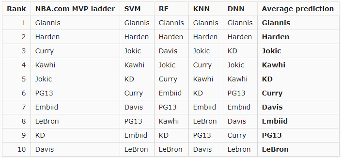
The 4 graphs below show each model's results. Each player's current rank in NBA.com's MVP ladder. Note that these predictions were made using data from 1/14 before the games were played.


All four models have Giannis as the winner, and Harden as the runner-up. Two models have Jokic coming in third, and the other two models (which have KD and Anthony Davis in third) have Jokic in fourth.
The graph below is the average predicted vote share of the four models for each player.

The average shows that the models have Giannis winning MVP by a decent margin. Harden also has a decent margin on Jokic.
Conclusion
The models crown Giannis as the MVP half-way through the year. Note that the models can't account for narrative, expectations, or voter fatigue; it's purely a statistical view.
This may change soon, as Harden scored 57 points the night I ran this analysis. With Capela out for the foreseeable and the Rockets still missing key pieces in Chris Paul and Eric Gordon, it's possible Harden ramps up his already absurd scoring pace, making a strong case for MVP. I'll run the models again with new data around the All-Star break to see if Harden caught up.
Comments
Post a Comment